matplotlib with wxPython GUIs

August 1st, 2008 at 9:24 am

As I wrote in the last post, I found matplotlib to be a very nice library for plotting. So, considering that I really plan to use it for my Python programs at work, I’ve spent a little time to write some proof-of-concept code (I do this often when learning a new library. Nothing serves as a better reference than your own code).

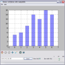
The first demo I wrote displays a bar plot, allowing the user to change the data shown on it in real-time, as well as using the matplotlib navigation toolbar and saving the plot to a file. Additionally, it allows some basic interaction with the plot (clicking on a bar brings up a message box) and playing with the plot’s properties like the grid and the width of the bars.

demo_bars.PNG

You can download this demo from here.

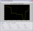
The second demo is rather more sophisticated. It explores the dynamic abilities of matplotlib, which allows smooth and flicker-less animation. This demo features a “live” graph that runs continuously (unless the user asks it to pause). The user can explore the graph by selecting limits for the X and Y axes, and select whether he wants to see the grid and the X axis labels.

demo_graph.PNG

It can be downloaded from here.

Related posts:

  1. matplotlib with PyQt GUIs
  2. matplotlib - plotting with Python
  3. A Tetris clone in Python / wxPython
  4. Plotting in Python: matplotlib vs. PyQwt
  5. More PyQt plotting demos

36 Responses to “matplotlib with wxPython GUIs”

  1. FredrikNo Gravatar Says:

    Awesome, thanks.

  2. Brett_McSNo Gravatar Says:

    Fantastic. I’ve been using matplotlib for a while, and have done a bit of wxPython, but have never put the two together. This should get me started. Many thanks.

  3. ChrisNo Gravatar Says:

    Live graph one failed with :
    RuntimeError: xdata and ydata must be the same length

  4. elibenNo Gravatar Says:

    Chris,
    Are you sure you didn’t change anything and / or have the up-to-date version of matplotlib ?

    The only two places in the code that populate the plot with data are:

    1. In the end of init_plot()

            self.plot_data = self.axes.plot(
                self.data,
                linewidth=1,
                color=(1, 1, 0),
                )[0]
    

    This only fills in the y axis, x will be automatically done by axes.plot

    2. In the end of draw_plot()

            self.plot_data.set_xdata(np.arange(len(self.data)))
            self.plot_data.set_ydata(np.array(self.data))
    

    These two obviously create arrays of the same length.

  5. ChrisNo Gravatar Says:

    Sorry - was using latest marked stable on Gentoo 0.91.2 - update to matplotlib-0.98.1 fixed it.

    Afaik the problem was between those two lines of draw_plot. Once you updated x - and before you updated y - the two didn’t match. Obviously now matplotlib handle it safely.

    Thanks

  6. EvertNo Gravatar Says:

    Eli, looks great! I was just Googling around for wxPython & matplotlib coming across these examples; great starting points.
    One thing: when trying on my Mac, the second example didn’t fully work: the radio buttons weren’t available, and I saw only one run of the live data. Could that be because of the wxPython version that ships with OS X 10.5? It’s 2.8.4.0, matplotlib is 0.98.0. Or is it just intrinsic to the OS X GUI?

  7. elibenNo Gravatar Says:

    Evert,

    Your version of wxPython does look a bit old…
    Though I don’t know much about OS X :-)

  8. EvertNo Gravatar Says:

    Tried with a up-to-date version (2.8.8.1) of wxPython; no luck.
    So I guess it’s more intrinsic to OS X/Aqua or so.
    If I ever find out, I might come back here to let you know; but that could be a few months (no hurry getting this right, as I don’t need it yet. I’m just playing around right now).

  9. EvertNo Gravatar Says:

    Eli, for your (and possibly other people’s) records: I now know what caused this.
    wxStaticBox/Sizer needs to be created before any of the controls inside it are created, otherwise it’ll draw on top of those of controls, and while you may be able to see them, you cannot “reach” (click) them. MS Windows (XP) is apparently a bit more forgiving there, so it worked for you (or it’s actually broken there, as I don’t know what’s the correct way to do this); apparently, with GTK it can even crash.

    So, the solution is to take the following two lines in the BoundControlBox’s __init__() method (wx_mpl_dynamic_graph.py), and move them up, just before the self.radio_auto is created:

            self.value = initval
    
            box = wx.StaticBox(self, -1, label)
            sizer = wx.StaticBoxSizer(box, wx.VERTICAL)
    
            self.radio_auto = wx.RadioButton(self, -1,
                label="Auto", style=wx.RB_GROUP)
    

    Then it works splendidly for me, and probably also on other platforms/window environments.
    More details at the wxwidgets.org wiki or eg this post in a mailinglist.

  10. elibenNo Gravatar Says:

    Evert,
    Thanks. I’ve updated the file to reflect this fix.

  11. Ron AdelmanNo Gravatar Says:

    Exactly what I was looking for. I have graphs in my application, but not on figurecanvas. I was just trying to get a barchart with wx and was headed down the wrong track. Snippits will save me some time. Thanks

  12. JeffH0821No Gravatar Says:

    This is a fantastic starting place for embedding the power of MPL into WxPy applications. I cannot thank you enough for getting me started and hopefully you will not mind if I shoot you notes here and there every so often.

    - Jeff

  13. razrNo Gravatar Says:

    thx a lot! i’m doing program to communicate with usb recorder (k8047d) and need to do real-time graph. your example is very useful.

  14. razrNo Gravatar Says:

    оказывается вы знаете русский (прочитал профиль). так что спасибо еще раз - на русском теперь)

  15. elibenNo Gravatar Says:

    Не за что :-)

  16. razrNo Gravatar Says:

    вот сел наконец разобраться с графиками, но что-то не получается организовать построение нескольких графиков на одном(
    очень буду рад если сможешь помочь, т.к. я только начинаю изучать python и не всё понимаю, а туториал по matplotlib как-то сложен.
    для простоты я выкинул всё ненужное из примера и оставил только сам график и кнопку пауза. вот что делал потом:
    добавил class DataGen2(),
    в GraphFrame() добавил self.datagen2=DataGen2(), self.data2 = [self.datagen2.next()],
    в init_plot() по аналогии добавил self.plot_data2,
    а вот дальше что делать с draw_plot() не знаю. пробовал добавить
    self.plot_data2.set_xdata(np.arange(len(self.data2)))
    self.plot_data2.set_ydata(np.array(self.data2))
    но ничего дельного из этого не вышло((
    если что вот полностью код - http://paste.org/5716

    в общем если будет время глянь пожалуйста.

  17. elibenNo Gravatar Says:

    @razr,

    Answer: http://paste.org/5723

    Сделай diff чтоб увидеть что я добавил

  18. razrNo Gravatar Says:

    спасибо. только я говорил немножко про другое - чтобы был один график и на нем строились две функции, а тут выходит два графика.
    или это нельзя сделать?

  19. elibenNo Gravatar Says:

    Then just change the creation of self.plot_data2 in init_plot, so that it’s created in self.axes and not self.axes2

    If you don’t need two subplots, just remove axes2 altogether

  20. razrNo Gravatar Says:

    thx a lot)

  21. Ed MarshallNo Gravatar Says:

    Your second example is almost exactly what I’ve been looking for; I had no idea matplotlib would actually perform that well being updated live in WX. Thank you so much for posting such a clear example!

  22. VladiuzNo Gravatar Says:

    Nice lib…

    Полезная библиотечка!

  23. p4freeNo Gravatar Says:

    hi. i want to show in x axe “1,2,3…” instead of “10,20,30…” in live plot program (for this timer it’s time in seconds). how can i do this?

  24. elibenNo Gravatar Says:

    @p4free,
    I think that the axes object is trying to space out the grid automatically, depending on the range of your data in X. If you show less data at the same time, you’ll see the units less spaced out.

  25. TomNo Gravatar Says:

    Great examples (and thanks for putting them in the public domain for easy reuse). The scrolling plot didn’t initially work on my installation, but it was easily fixed by changing the lines

    self.plot_data.set_xdata(np.arange(len(self.data)))
    self.plot_data.set_ydata(np.array(self.data))

    to the single line

    self.plot_data.set_data(np.arange(len(self.data)), np.array(self.data))

    From the comments, I see this modification is only needed in older versions of MPL. (Clearly, the older versions MPL is updating x and y one at a time and at the first update the lengths don’t match.)

  26. untumbeNo Gravatar Says:

    Please help
    I’m trying to make dynamic graph of data comming from intrument connected via GPIB. When I run the script I get:

    ValueError: need more than 0 values to unpack

    #!/usr/bin/python
    from pylab import *
    from visa import *

    keithley = instrument(”ASRL4::INSTR”)
    print keithley

    # adress instrumentu nastawiony na 16
    keithley.write(”++addr 16\n\t”)
    keithley.write(”*rst; status:preset; *cls”)
    #keithley.write(”trigger:source bus”)
    #keithley.write(”trigger:delay %f” % (500.0 / 1000.0))
    #keithley.write(”initiate”)
    #keithley.trigger()
    #keithley.wait_for_srq()

    ion()
    hold(False)

    n=1
    while 1:
    voltages=keithley.ask_for_values(”trace:data?”)
    d=float(sum(voltages)/len(voltages))
    plot(n,d,’bo’)
    n=n+1

  27. Ronaldo NunezNo Gravatar Says:

    Thank you! Very helpful!

  28. GregNo Gravatar Says:

    This is great. I used your code for my Arduino project, write-up here.

  29. HenriqueNo Gravatar Says:

    This examples are the best on internet! Thanks! But, do you know an method to use less CPU? I need to plot some data from a serial sensor but matpotlib uses a lot o CPU. Thanks Again!

  30. elibenNo Gravatar Says:

    matplotlib is quite CPU-hungry. For more performant code consider using PyQwt (search my blog for some relevant code).

  31. MattNo Gravatar Says:

    Very nice examples! Have you tried shrinking the window size though? For me the contents below the toolbar get merged with the canvas, not sure if it’s just my environment or not.

  32. PaulNo Gravatar Says:

    This is useful stuff. Thanks for sharing!

  33. yogesh karpateNo Gravatar Says:

    Dear Eliben,
    I’m novice to matplotlib and python . I want to interface your program to my application which generates the ECG data in text format.I want do show it in dynamic/animated way as same u demonstrated in drawing a dynamic mpl (matplotlib) plot in a wxPython application.My query is if I have one text file conating all numerical data values known as ecg.txt conataining only one column.
    How I can I put in following code snippet written by you
    class DataGen(object):
    “”" A silly class that generates pseudo-random data for
    display in the plot.
    “”"
    def __init__(self, init=50):
    self.data = self.init = init

    def next(self):
    self._recalc_data()
    return self.data

    def _recalc_data(self):
    delta = random.uniform(-0.5, 0.5)
    r = random.random()

    if r > 0.9:
    self.data += delta * 15
    elif r > 0.8:
    # attraction to the initial value
    delta += (0.5 if self.init > self.data else -0.5)
    self.data += delta
    else:
    self.data += delta

  34. elibenNo Gravatar Says:

    @yogesh,

    DataGen is a simple object on which next is continuously called to get a new data point. All you need to plug in another is to re implement it and provide the next method. In you initialization read the input file and then just provide the next value from it on each call of next.

  35. SteTNo Gravatar Says:

    Eli,

    Excellent code that will help me no-end in my application.
    What is the easiest way to get this to get this to display an incoming data stream via an np array?

  36. lechfeckNo Gravatar Says:

    Excellent code, save me a lot of time. Thank you

Leave a Reply

To post code with preserved formatting, enclose it in `backticks` (even multiple lines)